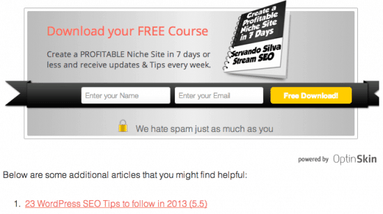
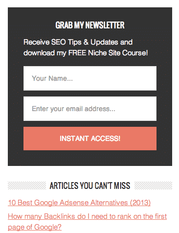
What’s better than explaining this with some real life examples?
We all struggle from time to time to get subscribers in our email lists. Whether we’re just starting and gathering our first 10 or 100 subscribers, and even if your blog is already receiving thousands of visitors, the conversion rate is usually low.
But can you do something to get more subscribers?
Of course!
And I’m not talking about “forcing” them to opt into your list, but to make it easier for them. So here are 9 reasons why you’re not getting as much email subscribers as you could:
Table of Contents
1. You’re not putting your opt in form at the eyes of your readers
How many opt in forms do you have in your blog?
If you don’t have 3 at least, you’re losing subscribers. Here at Stream SEO I used to have 1 form only on my sidebar (and it was in between many other widgets). After I started adding an opt in form at the end of each post, on my About Page and even at the top of my blog, I started getting A LOT more conversions.
It’s not that we’re bombarding our readers with opt in boxes. Just select the right places and make sure those don’t overlap to make it easy for them to subscribe. Think about Social Media buttons that follow you to make easier for your readers to share or like something.
The best places I’ve seen to put an opt in box are:
- At the top of the blog: with a bar (I use the Viper Bar from the creator of Optin Skin)
- At the top of the sidebar: or at the bottom of it (depends on your web design). Never put it at the middle between other widgets and banners.
- At the footer of your website: if they have scrolled all the way down, they probably want to subscribe.
- At the end of any post: Again, if they already scrolled down and read all your post, there’s a good chance they want to opt in.
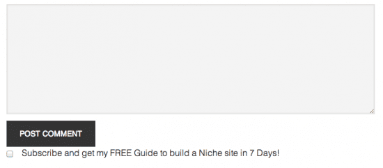
- On your comments: Another way I’m capturing leads is by adding a check box in the comments to subscribe. Comments mean they’re already engaging with you, so, why not offer them to subscribe at the same time?
The only opt in form I don’t like to use (and to see) but many people still use with good results is the pop up.
The reason why I hate it is because it seems to be very aggressive and intrusive. Some people won’t let you read the content unless you opt in.
From my point of view, this can result into:
- A new subscriber
- A new hater that won’t come back anymore
But who knows. It might work for you.
2. You’re not showing the advantages of being a subscriber
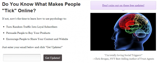
Derek Halpern from Social Triggers uses a featured box to create an opt in form at the top of the homepage to get tons of subscribers (just passed the 95,000 milestone). However, the key here is that he’s not only offering to become a subscriber, but actually tells you what you can expect to receive and why it matters.
If I’m really interested on the niche, I’ll subscribe and it won’t be just another newsletter arriving to my inbox.
3. You’re not giving away something
Another easy way to increase conversions is to offer something extra or FREE in exchange.
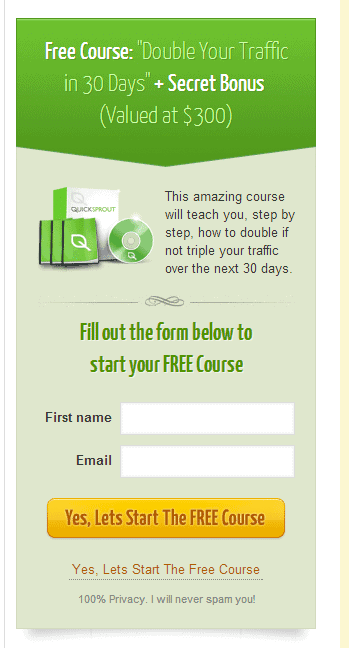
Neil Pateil from Quicksprout offers a FREE course to learn how to double your traffic in 30 days. He even includes a “secret bonus” and he’s adding a $300 value to its course.
You can offer an ebook or a guide to start something. Or you can even do a course by creating auto responders and sending them certain days of the week.
If you’ve got an online store, you could offer an especial discount to your subscribers and then capture them to buy and receive updates from you whenever you want.
4. You’re asking for way too much information
I know you want to know your audience, and you want to be personal. If possible, I’d ask for name, email, city, age and more. But to be honest, this only hurts my blog because less people will feel comfortable.
And we’re pretty lazy too.
So make it simple and ask yourself what do you really need from your readers to subscribe?
If you just need the email then don’t ask for more. I usually ask for the email and name (depending on which opt in form they subscribe from) and that’s all.
5. You’re only using an RSS
Google recently anounced they’re discontinuing their RSS Reader service. I won’t make a discussion between RSS and autoresponders (this has been commented before) but if you’re just offering an RSS subscription you’re doing it wrong.
If you don’t want to pay for a mailing service then you can always start with Mailchimp. You can send 6 emails per month and have a list up to 2,000 subscribers before they start charging for it. Just make sure you read the TOS before. They’re pretty strict about SPAM.
Also, you’ll be able to contact your subscribers even when you don’t write a post.
6. You’re not using the right colors.
If your blog’s background is totally white and your links and titles are blue, how can you get more conversions to your list?
Many people think they should use a totally different color to make it stand out from the rest of the content, and there are a lot of theories and case studies where red or orange colors convert more.
However, the reality is that you need to help your readers understand where they need to click or press the subscribe button.
So, if your links are blue, then put a blue button to subscribe, not a red one. Try to use high contrast colors on your blog for this kind of actions and you’ll see more clicks (not only subscribers).
7. You’re not asking them to subscribe
Sometimes it’s that easy. If you have a great post and you want your readers to share it, then ask them to do so.
You want them to subscribe? Sometimes it’s good to remember them they can easily subscribe via your opt in forms. You’d be surprised to know many of them haven’t seen those forms before because somehow they become invisible to their eyes.
8. You’re not creating curiosity
Do you ever write posts with several parts or experiments and case studies you can update?
If not, then you should start now.
By creating a series of posts or case studies you can update your posts after a few days or weeks. If the post is good enough to gain their interest, then add a subscribe box so that they can come back later and read the second part, and the third, and so on…
The thing here is that sometimes you don’t need to write all the post and results. Keep some secrets and bonuses with yourself and release them to your subscribers as a premium.
For example, in my Website Speed experiment, I ask my readers to subscribe to my blog so they can receive updates every week on how I’m doing with my rankings.
Many people felt that was an easy way to remember even if they didn’t bookmarked my post or came back later, so it worked.
9. You’re not doing A/B tests
A/B tests mean you use different positions, colors, forms and evaluate them to see which ones are receiving more clicks.
One way you can easily to this is using the Optin Skin plugin and the Viper Bar, but if you can’t, at least put a tracking code on each form so that you know where your subscribers are engaging.
Then you can try one month with the opt in box at the top of the sidebar and another at the bottom and measure results.
There are infinite ways to do A/B tests, and you should always do them to enhance your opt in rate.
Show me your tips
If you have another tip to increase your email subscribers list or if you have done tests and discovered one thing works better than other, please leave a comment below.
I’ll be very happy to share it with my audience and give you credit back.


